


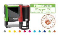


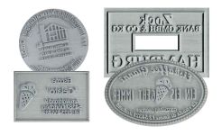


Why an individual company logo
Communicating professionalism
“Having your own logo not only ensures a serious presence on the market, but also a positive perception among potential customers,” says Silke Amling from b.unique Mediendesign.
Communication of the company philosophy
Matthias Fink from fink grafik+werbung is of the same opinion. He emphasizes that an individual company logo represents the "face" of the company and is therefore the most important element of the company's image: "It conveys the identity, values and philosophy of a company or institution - both internally and externally."
Expression of individuality
"The individual design of a logo is essential, as pre-made logos are usually interchangeable and appear arbitrary," explains graphic designer Philip Esch from Eschdesigns. As the most important and memorable component of a company's visual appearance, individuality should be the focus.
Building customer trust
"Only with an individual and original logo can you differentiate yourself from the competition and appeal to customers on an emotional level," says Meike Eitel from Mühle Lüsse. This creates a memory effect and builds trust with the customer.
5 design tips: What matters
A successful company logo should be individual, recognizable, original and professional. Silke Amling emphasizes: "The bait must appeal to the fish - not the angler. The logo must primarily appeal to the target group." However, there are a few basic ingredients that form the basis of a successful logo:
- Focus on the core message Many companies make the mistake of trying to pack too much information into the logo. “A logo must be easy to understand,” warns Silke Amling. The company's advantages should be reduced to a clear core message. Meike Eitel recommends: "Design your logotype so that the core message and identity are reflected in it. Ideally,
- “All relevant product associations should be conveyed with just one meaningful word or logo.”
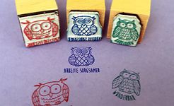
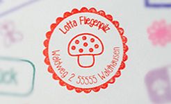
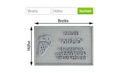
- Simplicity and functionality To ensure that the logo can be quickly grasped and correctly understood by the customer, the design should be kept simple. "It should be scalable in different sizes, so it should be visible from a distance as well as small on a ballpoint pen," recommends Matthias Fink. Silke Amling adds that it is advantageous to develop variations of the logo depending on the usage requirements, such as a black and white version for the stamp.
- Suitable font The design elements of a logo, such as the font, have an emotional effect. "The font should not be too subject to fashion, so that the logo still appears 'up-to-date' even after years," says Silke Amling. Philip Esch adds: "Emotions are conveyed subconsciously through the shape of the font and its historical context."
- The right choice of color "The color scheme is the dominant factor in generating certain emotions in the viewer," says Philip Esch. Silke Amling recommends: "The colors should harmonize well with each other. You can play with tones from the same color world or with complementary contrasts." Too many colors appear overloaded and can overwhelm the viewer.
- Hiring a professional graphic designer In order to implement the above points efficiently and professionally, working with an experienced professional is essential. Meike Eitel confirms: "Homemade logos usually look homemade." A professional graphic designer can help to clearly formulate the company identity and prepare it in a way that is appropriate for the target group. Matthias Fink emphasizes: "You should give the graphic designer time to get to know the company and develop the logo."
Successful company logos: three examples
- WWF The WWF's famous panda logo is characterized by its composition of open and large areas. It was designed by Peter Markham Scott, one of the co-founders of the WWF.
- Mercedes The legendary Mercedes star is characterized by simplicity and symmetry, which gives it its peculiar elegance and perfectly reflects the corporate philosophy of the car brand.
- Nike The so-called Nike swoosh conveys dynamism and speed. The logo was designed in 1971 by Carolyn Davidson, who sold it for just $35 while studying graphic design.
Fatal errors in design
- Profanity Philip Esch warns against too much clarity: “Profanity is the design downfall of a logo. “Feelings should be created subconsciously.”
- Lack of differentiation Imitated or copied design elements cause confusion and reduce the recall effect. "Random logos make it difficult to position a company and do not stand out," says Matthias Fink.
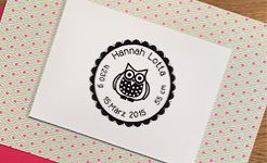
- Small details Logos that are too complicated are not ideal for display on stamps. "Elaborate designs with lots of little extras only have their full effect on large advertising banners," emphasizes Meike Eitel.
Interview partners:
- Silke Amling from b.unique Mediendesign The advertising agency from Bonn is characterized by years of expertise in the field of logo design.
- Matthias Fink from fink grafik+werbung The freelance advertising and graphic designer from Dresden has extensive experience in logo development.
- Meike Eitel from Mühle Lüsse The communication designer creates creative designs in an old mill and has years of professional experience in creative development.
- Philip Esch from Eschdesigns The graphic designer from the city of creatives specializes in communication design and has extensive experience in logo design.


